Trying something new … please let me know if you experience issues.
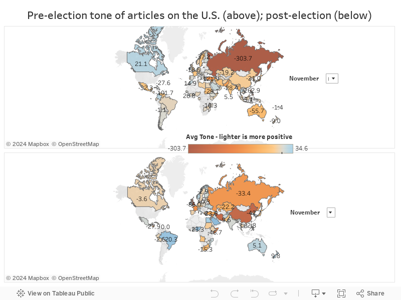
Using data from the GDELT Project and data visualization tools from Tableau, put together this image of world opinion pre and post election. Note the huge (yuuuge?) improvement in Russian opinion, followed by Australia and Brazil, and the negative swing in Canada, England, and elsewhere.
The data is from 1-11 November. Feel free to change the dates and scroll over various countries for further details (e.g. the number of articles and sources). Data is country-by-country government and media articles/reports on the U.S. – these are all stories on the U.S., not just stories on the U.S. elections.
The original visualization is hosted here on Tableau Public. Enjoy!